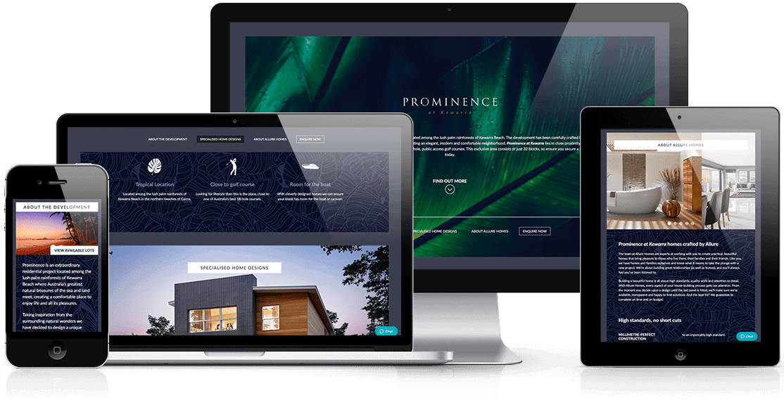
The Challenge
To develop a premium brand for a small housing development in Cairns. The brand needed to instill a sense of prestige and exclusiveness while maintaining a tropical feel associated with the region. A broad appeal across many demographics would also help Prominence achieve solid results.
Our Approach
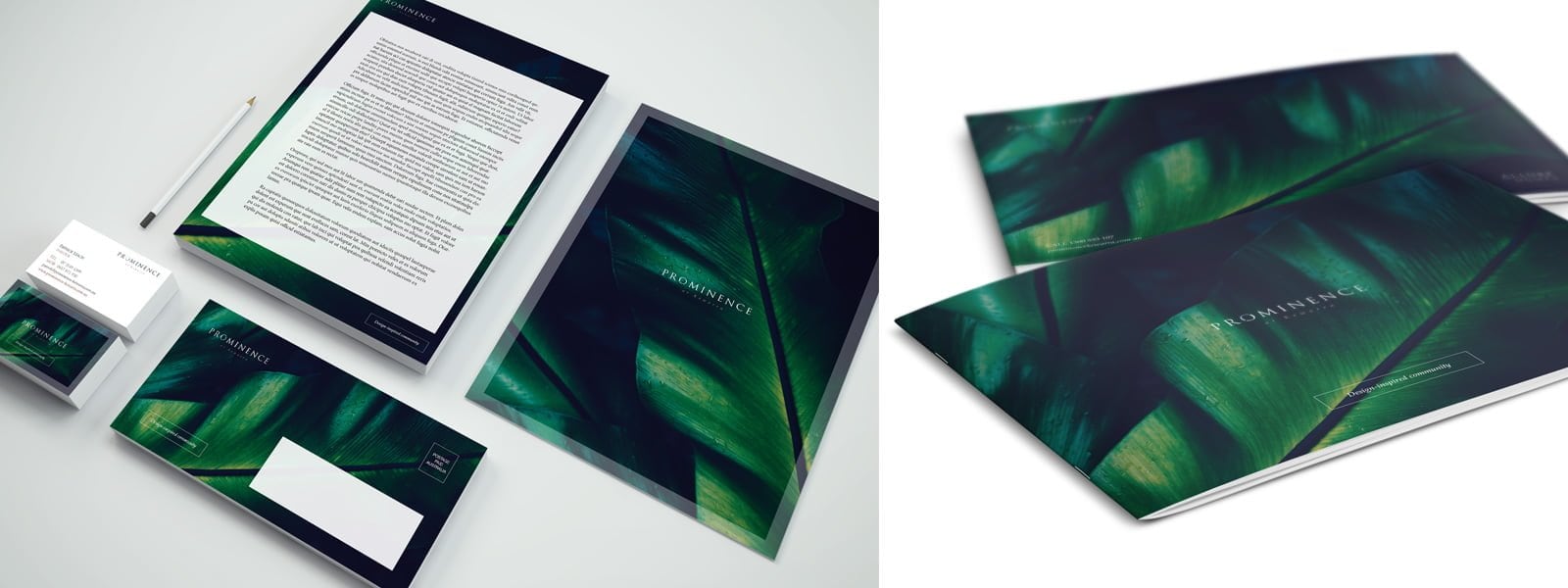
To the brand a great foundation we utilised a lush tropical background image to highlight the tropical location while giving the brand an luxury feel. This was achieved by the use of traditional font selection in the logo over this deep coloured image. The combination of the sans serif font and wide letter spacing in the logo gives a classic feel of style, with the subtle pastel colour scheme offering a calming indulgent influence. The overall feel is that of tropical exclusiveness.
This feature image was used in all marketing collateral and online experiences for brand consistency. The rollout across the brand touchpoints was joined by supporting build quality and locational imagery, increasing the visual story of the quality and exclusivity of the development.
We utilised a tropical leaf image as the core visual identifier for the brand for a deep lush aesthetic.
Services Delivered
- Branding Strategy
- Visual Identity and Assets
- Brand Guidelines
- Stationery
- Website
- Lot Plates
- Overview Brochure


